ShopDreamUp AI ArtDreamUp

Deviation Actions


Description
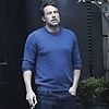
Revised version after a critique (rightfully so) pointed out some areas needed some attention, although still not perfect hopefully this version improves on the previous one. I,m happier with this version.
But as always it's over to you.......
Raj from Big Bang Theory,done in Artrage 2.6.
Here are the others so far


But as always it's over to you.......
Raj from Big Bang Theory,done in Artrage 2.6.
Here are the others so far
Image size
930x1240px 143.03 KB
© 2012 - 2024 garrypfc
Comments8
Join the community to add your comment. Already a deviant? Log In
It would have been great if you posted a link to the old version as well as its critique, because it's hard to tell what you improved on. Also it'd be awesome if you put up the original photo from which you painted as well.
Positive things:
Composition: the portrait itself looks balanced and harmonious. The slight turn of the head and expression makes it interesting and captivating.
Detail: the clothes are nicely detailed, especially the sweater. I like how the shade from the collar falls on it.
Things to improve on:
Background: seriously, try to come up with better backgrounds. Look at classic portraits and see how they did their backgrounds, even if there's nothing there, the background still got plenty of attention. You'll notice the difference right away and your portrait will look completed.
Color: even thought the colors aren't at a disagreement with each other, I'd subdue them a bit, especially the background.
And last but not least, the painting of the flesh: Even though your technique is good and you capture the likeness of the person, the face and neck could use a bit more work. For each highlight and shadow you should pick more colors. For example, the area on his neck looks too plain. Pick 2-3 colors: dark, medium, darker, and work on subtle details of the neck like the jawline. The highlight on his face like the cheeks and chin is again too one-dimentional, pick 2 colors for that, one slightly lighter than the other. With the darker highlight, make your brush as big as quarter of the face and very transparent and lightly touch the cheeks, and with a lighter color and smaller less transparent brush make a careful highlight. The lips could also use some more color variation.
My suggestion would be to take a couple of photos you want to paint and pick the colors from the photos by a dropper from different areas and use those colors to paint with. This is just exercise for you to see the variety of color in nature. So, don't try to match the color from the photo but use a dropper and copy the color from the photo. Try to make it look as closely as possible to the photo And then after that paint as you usually do. You'll see a lot of improvement.
You can also benefit from doing hair studies and color theory.
Best of luck and enjoy! You're on the right path.